Gone AWOL

You nay have gathered I don’t use my blog any more. Facebook seems to have taken over and you can find me at www.facebook.com/keith.hornblower and on Instagram at www.instagram.com/hornblowerart.

I also have a brand new web site with all my latest work. Hope to see you there! http://www.hornblowerart.com

Staithes – a recent watercolour.

BBC – Big Painting Challenge

Had to chuckle just now. The Beeb have been plugging the new painting series and in the trailer, one of the “experts” is having a dig at one of the amateur contestanrs. He tells him “If you always paint what you want to paint, you’ll never get anywhere”.

On the news tonight, David Hockney being interviewed on the opening of his major exhibition At The Tate, when he said “I’ve always painted exactly what I want to paint, every day of my life”.

Never trust an expert.

SiglufjörĂ°ur, Iceland. A Summer Workshop for 2017!

I am happy to announce that I shall be running a workshop in the North of Iceland, based in the historic herring fishing village of SiglufjörĂ°ur, surrounded by the drama of Iceland’s other-worldly volcanic landscapes. Spaces are limited, so do let me know if you would like to join me!

water-color-course-keith-hornblower-2017-kh-edit

By coincidence, my painting of this church in Reykjavik has passed pre-selection for the RI exhibition at the Mall Galleries this year. Fingers crossed for the next stage..

hallgrimskirkja-reykjavik_hornblower-watercolour

Watercolour Workshop in Iceland – Breaking News!

I shall be running a one week workshop the first half of September 2017 in Iceland, the venue and final dates are to be confirmed, but if you think you may be interested please send me a message. Places will be on a first come, first served basis. For further information contact the organiser here: http://arttravel.is/contact/harbour-hornblower-watercolour-sketch

It’s a fascinating and beautiful country and I’m itching to paint there again. So much to inspire – join me there!

Figure Drawing

2016-11-22_1_hornblower_charcoal

It’s a record: 2 blog entries in 2 days! Figure drawing class this morning, run by Jo Stone, so Tuesday mornings I’m the student for a change, although I do my own thing pretty much.

I tend to use charcoal most of the time, so I can use the whole tonal range from black to white, and as you should know by now, tone is my thing! I’m thinking about the light more than line or anything else, and Jo is very good at positioning a lamp for maximum dramatic effect.

No long poses – most are 5 minutes, sometimes 10, although one of these was a lengthy 20 minute pose which I had actually finished in about 15 minutes. See if you can guess which one..

I don’t do these for any other reason than enjoyment and relaxation. There’s no pressure to succeed or achieve anything in particular and it makes such a change from painting (illustrating) buildings. I can just lose myself in all those beautiful curves.

This slideshow requires JavaScript.

Demo session, Saffron Walden


saffronwalden-hornblower_watercolour_demoHands up; I am the world’s worst blogger. I put stuff on Facebook, forgetting that I can post it here and then share it on FB – a much better way to do things.

So, I was booked to do a watercolour demonstration for Saffron Walden Art Society. The turnout was surprisingly good, considering it was Children In Need night on the telly (a must-see yearly event) and I reckon there were about 50 people present. Thank you Saffron Walden for your support.

The subject was a townscape and I always try to paint something local which everyone will recognise. SW is a particularly attractive town with a beautiful church, lots of very old buildings, and alarmingly sloping streets; I chose a fairly challenging view taking in lots of buildings and the church in the distance. I made things even more difficult for myself by moving the sun! I thought that contre-jour would add more drama.

I kept the drawing to a minimum. Draw too tightly and you just end up colouring the drawing as opposed to producing a painting. Time was tight too; I normally have about an hour and a half to complete a painting and I never draw the thing out beforehand (as some demonstrators do).

I attacked the paper with more than my usual abandon, throwing on paint with gusto, and the image slowly took shape as I progressively added the darks.

And then things got interesting as one chap asked “When are you going to add the windows to the church?”, echoed by one or two others in the audience. I explained that as the street is the subject of my painting and the church merely a backdrop, a silhouette on the horizon, I wasn’t going to add them at all. It sparked a lively debate and I was tickled pink; I had reached the end of a demo and everyone was still awake!

But the interesting thing is that the fellow who asked the question (more than once – it really bothered him) had also spoken to me minutes before, during the half-time break, and said to me “I WISH I COULD PAINT LOOSE THE WAY YOU DO”. Painting loose means picking out the big shapes, simplifying, and suggesting detail rather than spelling it out, which is exactly what I had done, but he really couldn’t handle the fact that I had deliberately not painted something which clearly exists. I suspect that he is doomed forever to produce slavish copies of photos with no hint of passion, interpretation, excitement, expression…..

I don’t mean to pick on the chap – and I don’t take his criticism personally – but it is something I encounter almost every time I paint a demo, particularly with the older generation I’m sorry to say. And being one of them, I don’t see that it comes with the territory.

It comes from years of doing the same thing, over and over, and being afraid to try something different. Experimentation necessarily entails making mistakes and this is too much to handle for many. I say that mistakes are not only inevitable (I make more than most) but that they are essential in order to progress.

So be brave, have fun, make a mess. It’s the only way. Happy painting!

Hue, Chroma, Value

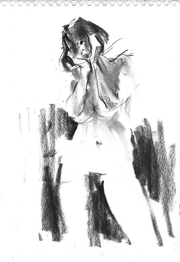
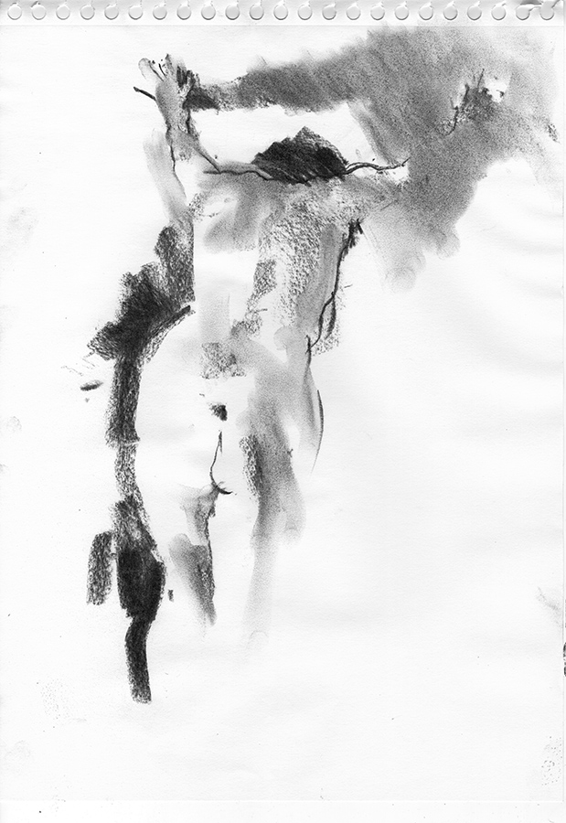
Now I don’t like to get technical – painting should be a matter of passion and instinct – but there are certain things I think it’s good to be aware of when it comes to colour, so here’s my take on the basics which are HUE, CHROMA and VALUE.

HUE is just a description of the basic (saturated) colour plucked from a rainbow. Easy, eh?

rainbow

CHROMA is where it gets interesting. The colours we see around us are rarely rainbow intense. When I was a kid, I remember being taught colours – red, yellow, blue, orange… and I would go around the room trying to pick them out. I’m sure you did the same – everyone did. But do you remember having an uneasy awareness that the world didn’t generally conform to this simplified idea of colour and that they only really occurred in your toys, the red telephone and Mum’s dress?

We are, in fact, surrounded by colours we can’t easily describe and this is where chroma comes in, because nearly everything we see is greyed to some extent. The greyer, or more neutral, a colour is, the lower the chroma and it’s achieved by mixing ALL the primaries together in varying proportions, so to make a soft yellow, add a touch of purple. I always say the secret to a natural green is RED! So if your green is looking too intense (high chroma), try adding a little pigment containing red – maybe burnt sienna, or lilac. If you’re mixing a green from scratch, rather than using lemon yellow (yellow with a touch of blue) and pthalo blue (blue with a touch of yellow) try cobalt (blue with a hint of red) with yellow ochre for a VERY soft green.

VALUE for me is the king, sometimes described as TONE or TONAL VALUE. It is the lightness or darkness of the colour and is not related to the colour itself. For example, I have seen young students try to paint the sun using lots of intense yellow to make it bright, but value-wise it’s actually low on the scale. If you think in terms of colour washes, the paler the wash, the higher the value irrespective of what colour you’re using. So the brightest area of a painting could well be a neutral grey; don’t confuse brightness with chroma, as it’s very easy to do so. For example, a sky could be described as bright; that would be a high VALUE. We could also have a bright red car, but here we would be describing its CHROMA and a better word would be vivid. Don’t confuse the two – they are very different things. Language can be so confusing..

It’s the LIGHT that defines our environment more than anything else. Just think of an iconic photograph and the chances are that it’s in black and white.

article-1342305-0056B2CC00000258-186_634x497

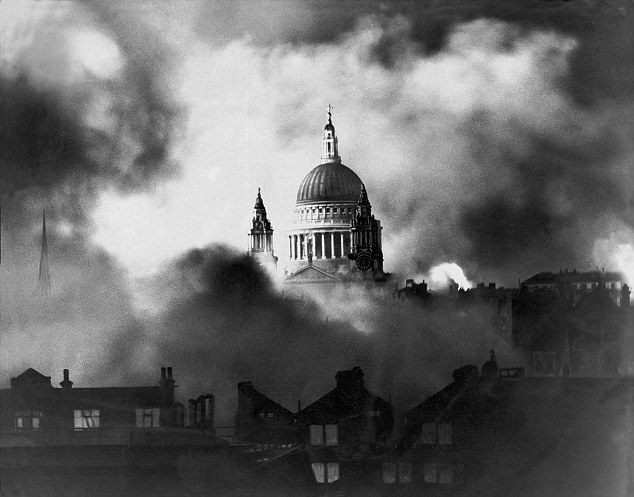
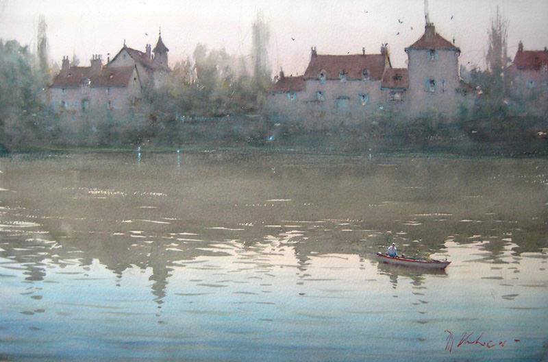
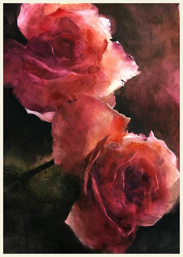
Once you strip away the colour, all you have left is the light, and therein lies the drama! Here’s a very dramatic painting, containing the full value range from the deepest black to pure white.

supper_at_emmaus

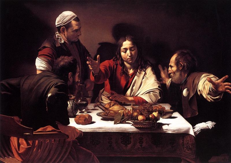
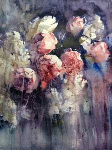
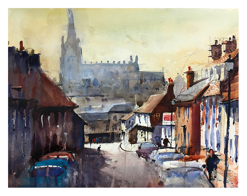
And here’s something altogether more gentle (by Joseph Zbukvic), where the values are predominantly mid-range and the variations very subtle:

18295_1639141892985572_4122869557823040558_n

Two very different approaches and both equally valid. It’s all down to the values.

All very well, but how to put this into practice? I’m a simple soul and like to keep things a simple as possible. I’m sure you’ve seen dozens of books on colour mixing and a bewildering array of colour wheels; I’ve never used any of them. So confusing!

wheels

The very best thing you can do is PLAY! Play with colour combinations, play with pigments. Pick a triad of colours, reddish, blueish, yellowish, grab a piece of scrap paper and see how they work with each other. Here’s a couple of mine – a warm, earthy one and a cooler more vivid one; my take on colour wheels:

triads

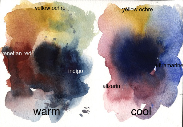
The blacks in the middle are a mix of the 3 colours in each case.

Personally, in the interests of keeping things simple, I think of pigments only in terms of primaries; this was my eureka moment. It all comes down to red, yellow, blue.

If you have a cheap printer, the inks will be magenta, cyan, yellow plus black to intensify the values, only because the printer can’t lay down the colours heavily enough to produce a deep black. So try to see the pigments in your palette as mixes of RYB; for example, I see Cobalt Blue as blue with a hint of red, Cadmium Red as a red with a touch of yellow and so on.

When it comes to choosing your pigments there is no magic combination; every artist’s palette is different, but they are all using red, yellow and blue in the end.

Experiment, play, have fun. The more you do, the better you get. So stop reading and get those paints out!

Less is More

A couple of quick sketches from Tuesday’s life class. I find these much more fun and dynamic than laboured drawings taking hours to produce. I have to think fast, work fast and extract the essentials from the subject without worrying about the fine details.

I’m always driven by the play of light and try to capture it as simply as possible. Look for strong contrasts, hard and soft textures, lost and found edges and so-called negative drawing, i.e. defining the shape by using dark tones around it, rather than using an outline.

Maximum impact with minimum effort!

2016-05-10A_Hornblower_charcoal_sketch2016-05-10B_Hornblower_charcoal_sketch