Fitzroy Square, London

I was recently contacted by a young lady who is getting married very soon; she wanted a painting of the spot where the proposal took place as a gift for her new husband. Lucky for me, he proposed in Fitzroy Square, which I know very well; the buildings are magnificent, having been designed by the great Robert Adam.

I didn’t want it to look too illustrative/photographic and it took me a great deal of effort to hold off the detail; my architectural illustrator hat had to be locked away in a cupboard. Instead, I wanted to capture the atmosphere of the place; the tracery of the tree shadows across the façade, the contrast of dark trees against light buildings.

I wish the couple a long and happy life together and hope the painting is a constant reminder of the joyous day.

A Demo for Stevenage Art Club

I took a fairly simple street scene and decided from the outset that my focus would be on the two central figures. If you look at the painting, the sharpest contrasts, darkest darks, lightest lights (white paper) and hardest edges are all in this area; that’s what attracts the eye.

I treated everything else as a backdrop to the main characters, simplifying detail or omitting it completely. Did it work? Let me know what you think!

Cromwell Stevenage Hornblower watercolour demo

The Hornblower guide to Composition

I’m not one for rules in painting – the most exciting things happen when they are broken – but there are a few things to be aware of when composing a picture. You don’t have to apply every rule to every painting, but knowing the rules means that when you break them you are doing so consciously. If you look at the examples below, they each illustrate one of the principles of composition and, in all likelihood, break most of the others.

A famous Chinese painter was asked by the Emperor to paint a decorative screen for him, the brief was a flock of geese. The artist painted the background landscape – and one goose, disappearing off the screen stage right. The flock was implied by the single goose. The Emperor was delighted, fortunately for the artist. He broke the rules and won – my kind of guy.

So here they are:

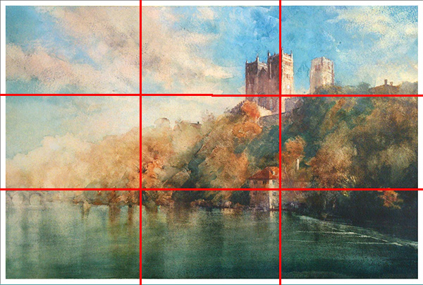
No.1 – The Rule of Thirds. By putting the focal point at one of the third points gives a nicely balanced asymmetrical picture. There are a myriad of classic paintings which don’t appear to have a focal point at all, so don’t get hung up on it!

Fig1

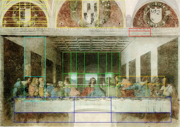
No.2 – The Golden Mean. There are many learned texts which extol the virtues of the magic “Golden Mean”, a rectangle with the proportions of approx.  1:1.6. They illustrate this by superimposing these rectangles, seemingly at random, all over classical paintings (see below). I take it with a pinch of salt; there is even a Golden Triangle and Spiral!

I would ignore this one; in fact I do ignore it…

fig2

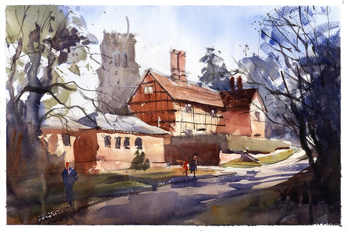
No.3 – Think about the orientation of the paper, landscape or portrait. Landscapes don’t have to be in landscape and portraits in portrait. Gustav Klimt went through a phase of painting in square format, very successfully.

fig3

No.4 – Simplify! Think about what the painting is all about – the reason you’re painting it in the first place. The chances are that there’s a lot of surrounding clutter which would distract the viewer; get rid of it, or at least play it down. In the same vein, look for strong silhouettes. Often, this is the boundary between sky and earth and painting against the light enhances the effect beautifully. It also has the added advantage of unnecessary detail being lost in the shadows.fig4

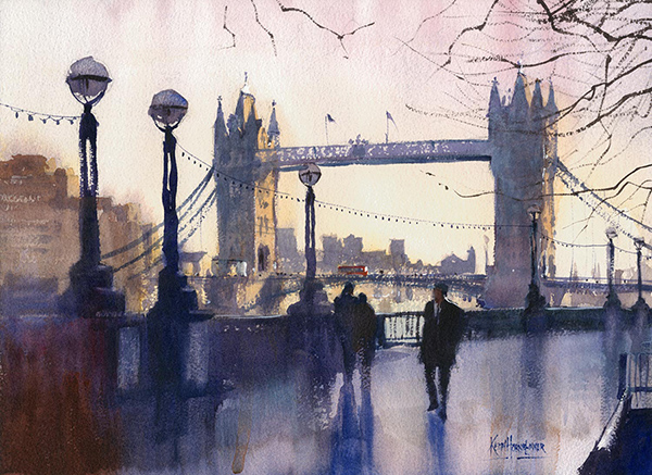
No.5 – Leading Lines. These are lines which draw the eye into and around the picture, for instance kerb lines, fences or an avenue of trees.fig5

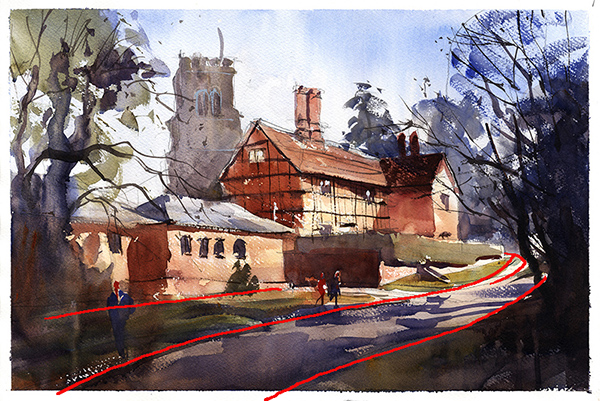
No.6 – Diagonals. following on from no.5, diagonal lines add dynamism to the picture, whereas horizontals and verticals are static. Moving in closer can often enhance the effect, so where you sit, or stand, is important! Do you need to be near, far, high or low?fig6

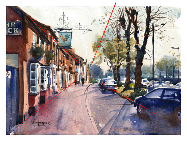
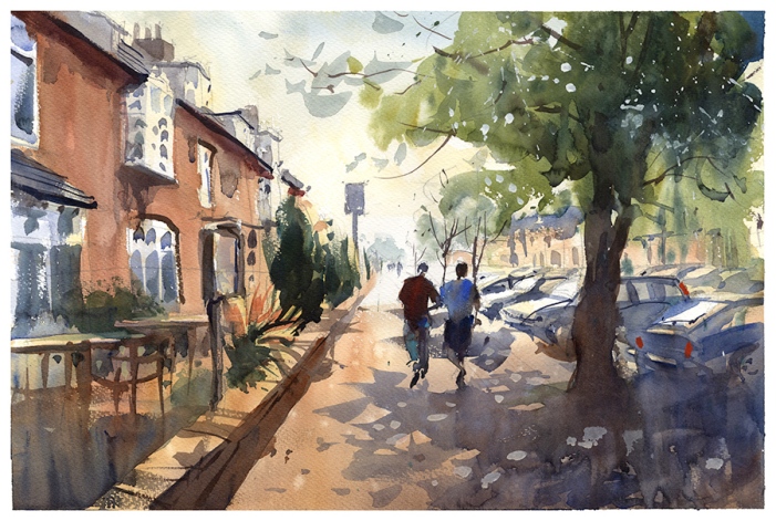
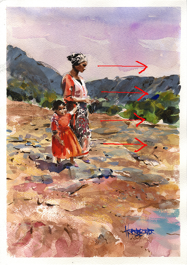
No.7 – Sense of movement. If your subject is people, cars, boats etc. give them space to move into. In the example below, the figures are set to left of centre because they are facing right.

fig7

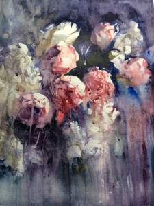
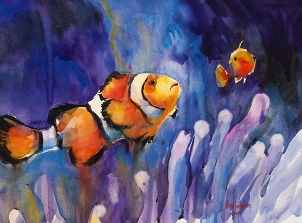
No.8 – The Rule of Odds. Odd numbers tend to work more harmoniously than evens. Don’t ask me why.

fig8

No.9 – Balance. A large object on one side needs to be balanced by something on the other side. That’s all.

OLYMPUS DIGITAL CAMERA


No.10 – Framing. I like to have something dark at the edges/ foreground to frame the picture. It helps lead the eye into the scene and also gives a feeling of aerial perspective.fig10

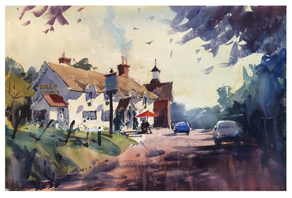
Also look for patterns of texture, shadows, colour etc. and a sense of harmony and rhythm. These come down to your own gut feelings and judgement; in the end, it all does, so if you think it works, do it!

I hope this helps and I’d love to hear your own ideas. Leave me a comment!

Mall Galleries

Great news today – my painting “Kitchen Door” was accepted into the Royal Institute of Painters in Water Colours 2016 exhibition in the Mall Galleries, London. It’s the first time I have entered, so feeling particularly chuffed! The exhibition commences 6th April 2016 and runs until 16th April.

The painting is a slightly unusual choice; I used very thick paint, laying it on, lifting it off and scratching through it to achieve the desired effect. Hope you like it.

Kitchen_Door_Hornblower_watercolour_flowers in vase

Another demo

This is a watercolour demonstration for Maulden Art Society – an imposing view of Husbourne Crawley. I used to pass it regularly on my way to the M1 motorway and the sight would always catch my eye. It was painted very quickly and simply using a limited palette; in fact, I finished half an hour early leaving more time for discussion.

I have received some very nice feedback from Jenny of the Art society:

“A big thank you from all at Maulden Art Group.

We were once again treated to an excellent masterclass demonstration of your very personal approach to using water colour. We all so admired what we perceive as pure bravery ( although it is clearly natural talent), when the darks and shadows are applied and all with the largest of brushes! It is what many of us aspire to but never quite relax enough to achieve the looseness we all so admire .

Thank you so much for sharing so much of your knowledge and experience with us once again and I’m sure the group will be suggesting a further visit from you in the future.”

Thank you Jenny!

HusbourneCrawley_Hornblower-watercolour-demo

Venice!

Off to see my favourite city tomorrow, the city of light, although judging by the weather forecast it’s looking like the city of rain…. It really doesn’t matter; Venice is beautiful rain or shine and I shall be sketching furiously whatever the weather.

Look out my next picture posts – you know what the theme is going to be… Venice paintings always sell, although that is not my motivation for painting them – it’s more a compulsion. But I do have 2 orders already!

See you soon.

Venice_street_cafe_Hornblower_watercolour

Flowers again!

Experimenting with painting surfaces again, this time priming the paper with acrylic gesso. Upside – easy to lift paint, downside – bloody difficult to get it to stick in the first place! Thin washes almost impossible; most of the paint was plastered on at tube consistency and the moved around and thinned on the surface. Tricky, but I hope worth the effort.